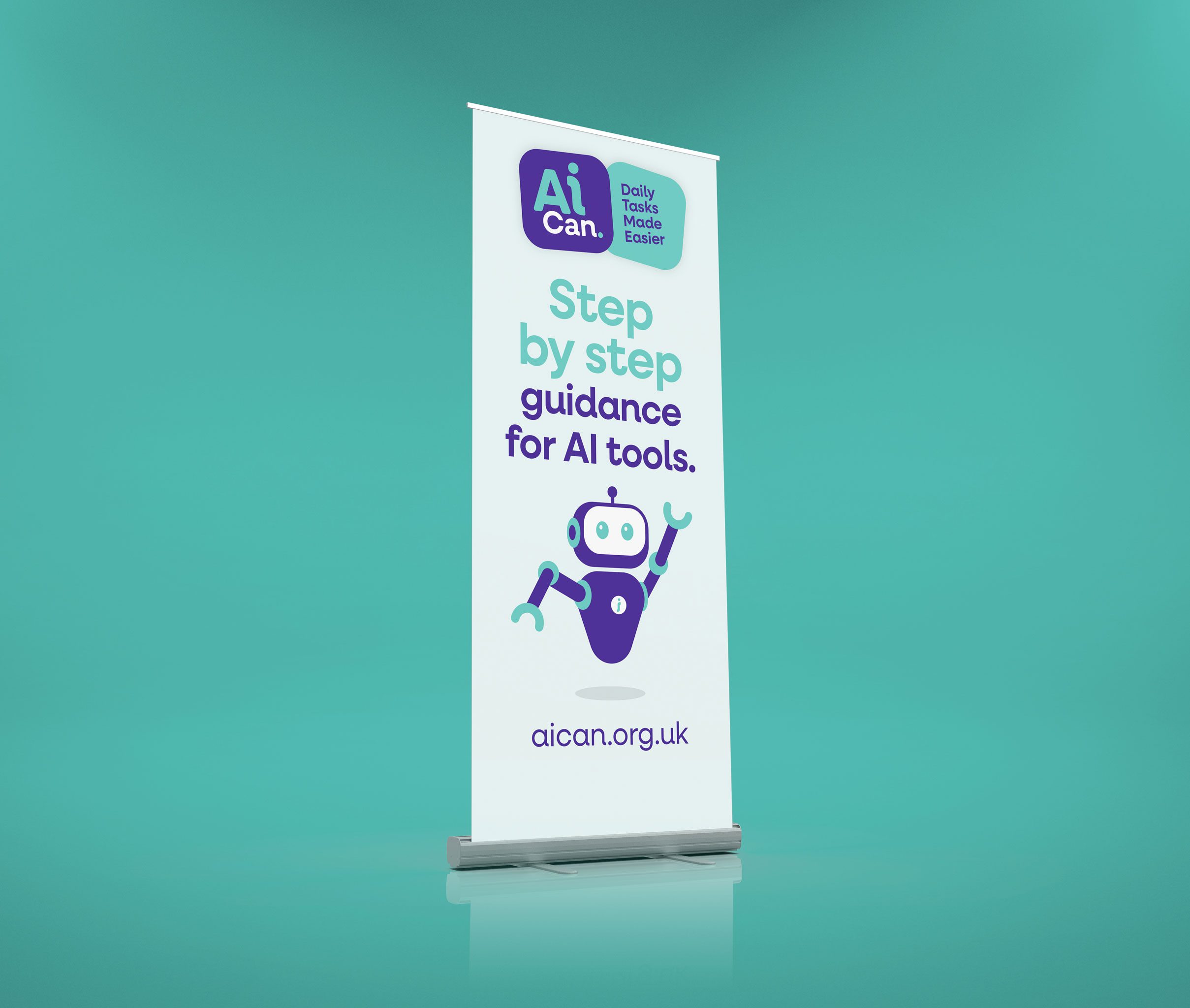
AiCan. - Step by step guidance for AI tools.
The Brief
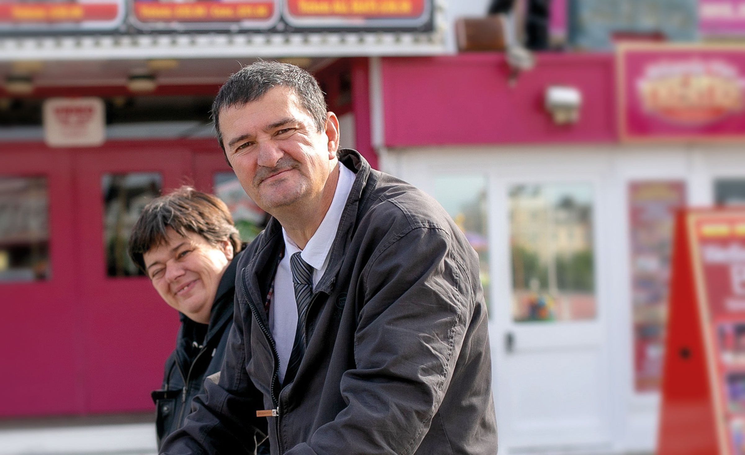
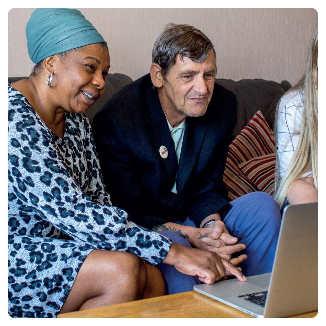
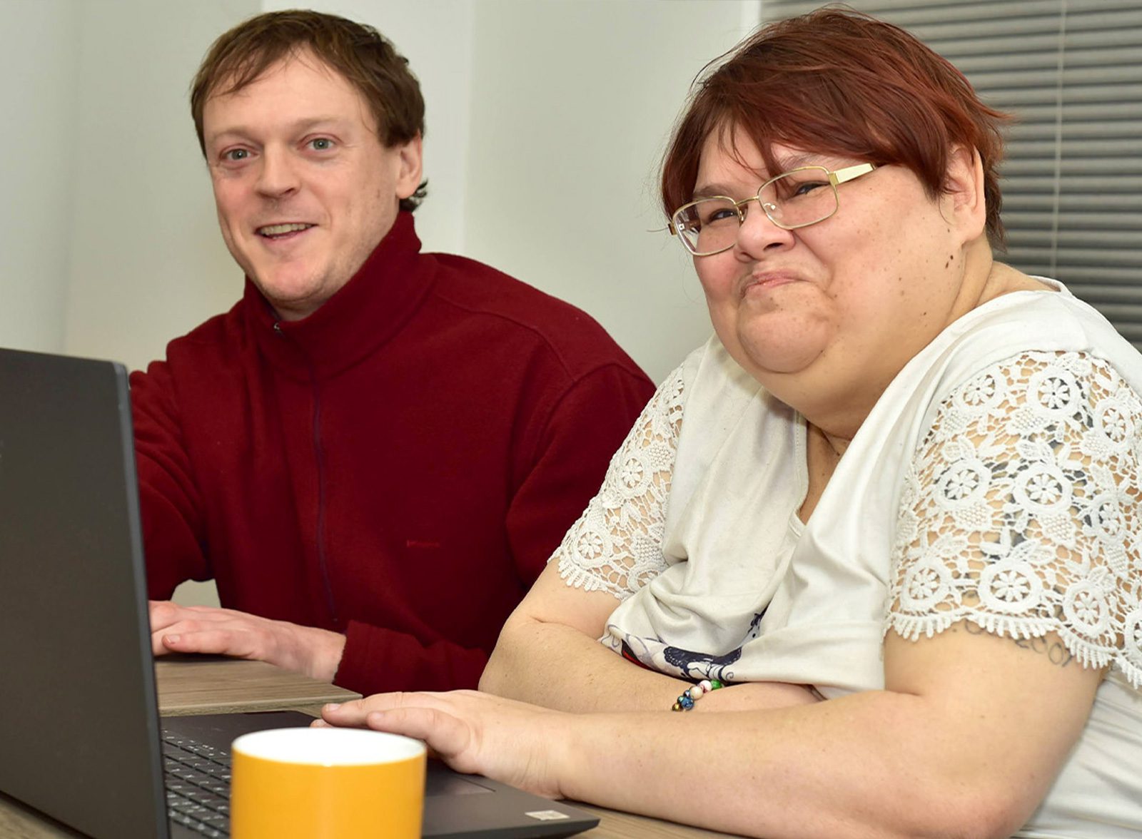
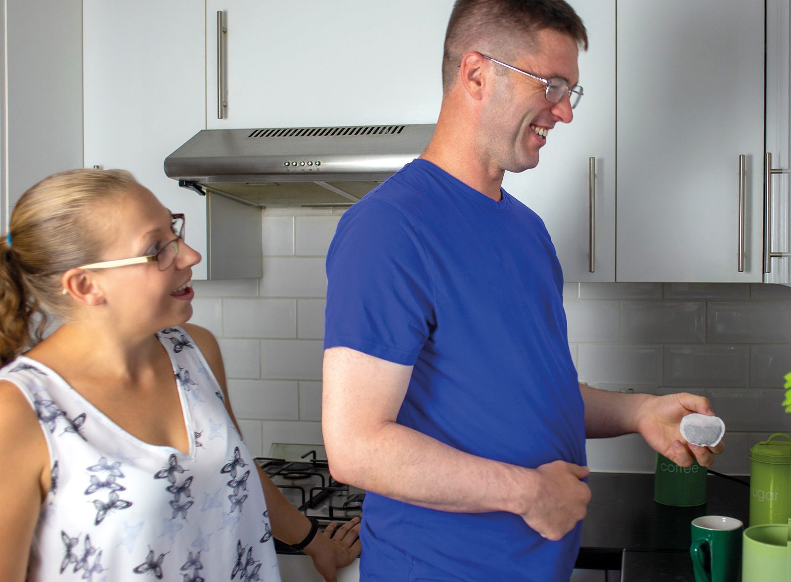
AiCan is a digital learning hub that helps autistic people understand and use AI in everyday life: money, forms, food, home, social situations. It’s a co-produced programme, developed with Active Prospects, Pro-Active Community and the University of Surrey’s Centre for Vision, Speech and Signal Processing, and funded by the Department for Science, Innovation and Technology.
Most “AI for everyone” branding looks the same: electric blue, sharp angles, a cold, faceless robot. Get it wrong and you build a barrier before anyone’s even logged in.
The challenge
Autistic users can be highly sensitive to bright colour, visual clutter, and busy layouts. So the brand had to do something most tech brands never attempt: feel calm before it feels clever.
That meant solving for two things at once. Warm enough to feel human and trustworthy. Clear enough that nobody has to work to understand it. Most brands pick one. We needed both, every time.
Project Scope
Visual Brand Concepts/ Brand Identity/ Illustration / UX / UI / Development / Design

The thinking
We started with colour, because it mattered most. We tested three directions: a sharp, tech-forward palette, a soft, muted one, and an organic, natural one. Each was run against the same question: does this calm someone down or wind them up?
Typography went through the same filter. Traditional serif felt too corporate. Quirky sans-serifs read as gimmicky and harder to parse. We needed something that looked friendly without trying too hard.
Even the name went through it. AICAN, AIcan, Ai•Can, AiCan: small choices, but for a brand built on reducing cognitive load, the letterforms themselves are part of the accessibility brief, not just decoration.


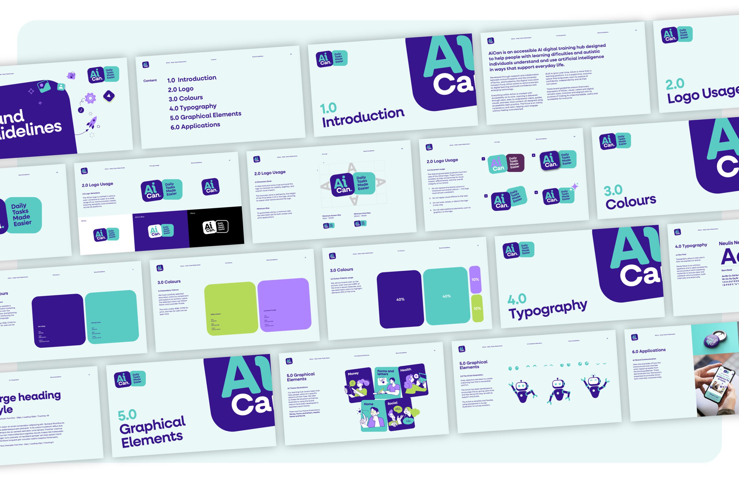
What we landed on
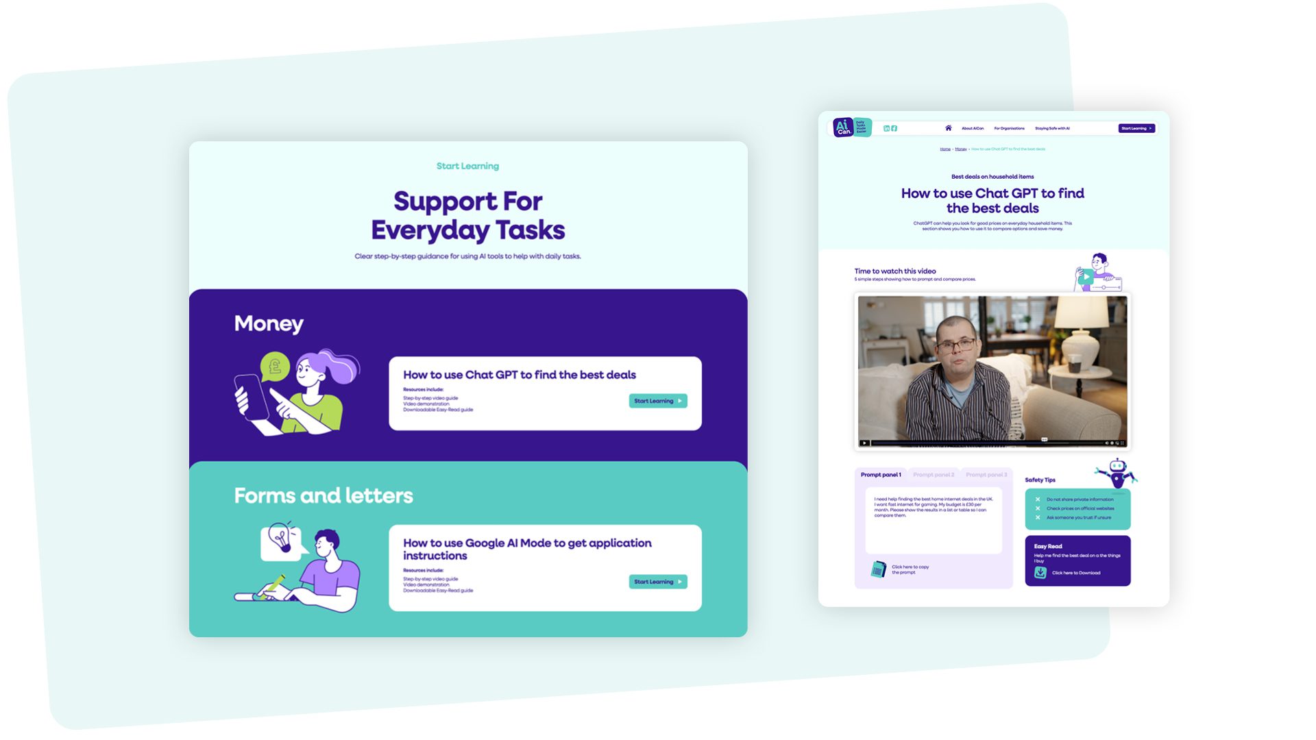
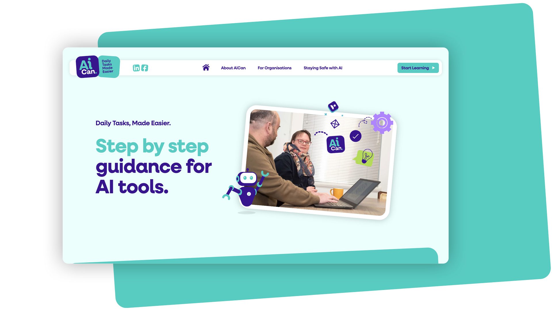
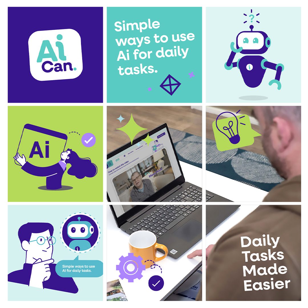
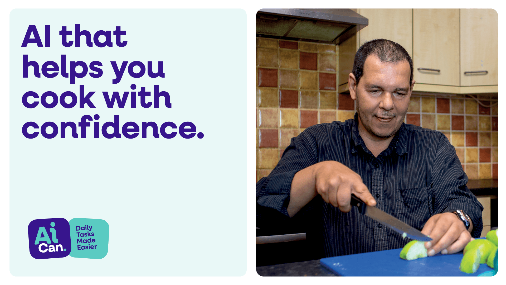
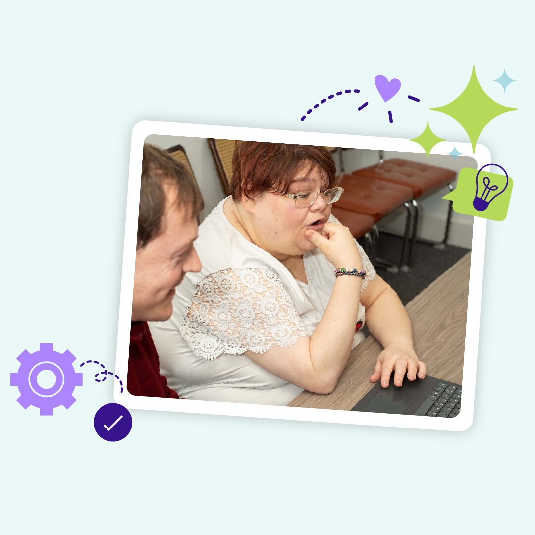
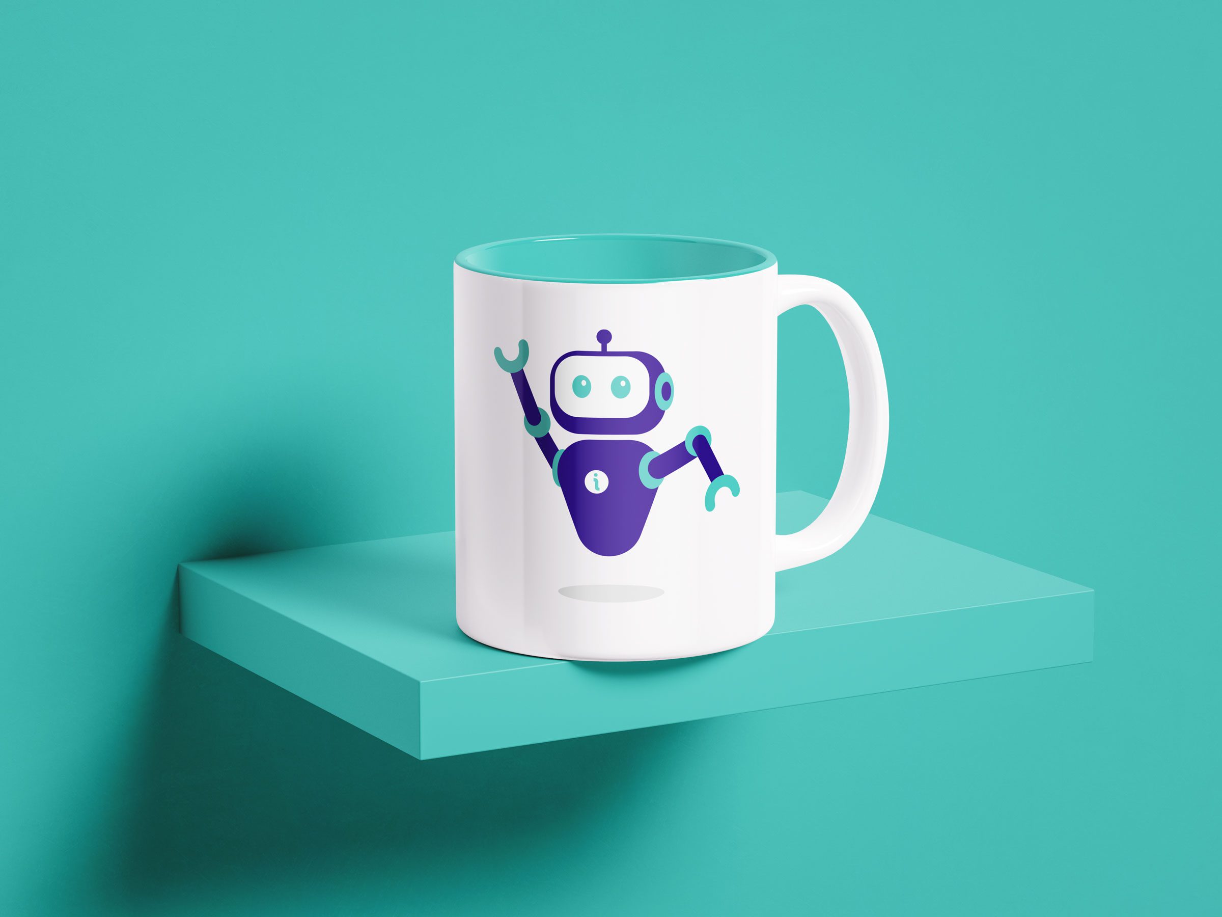
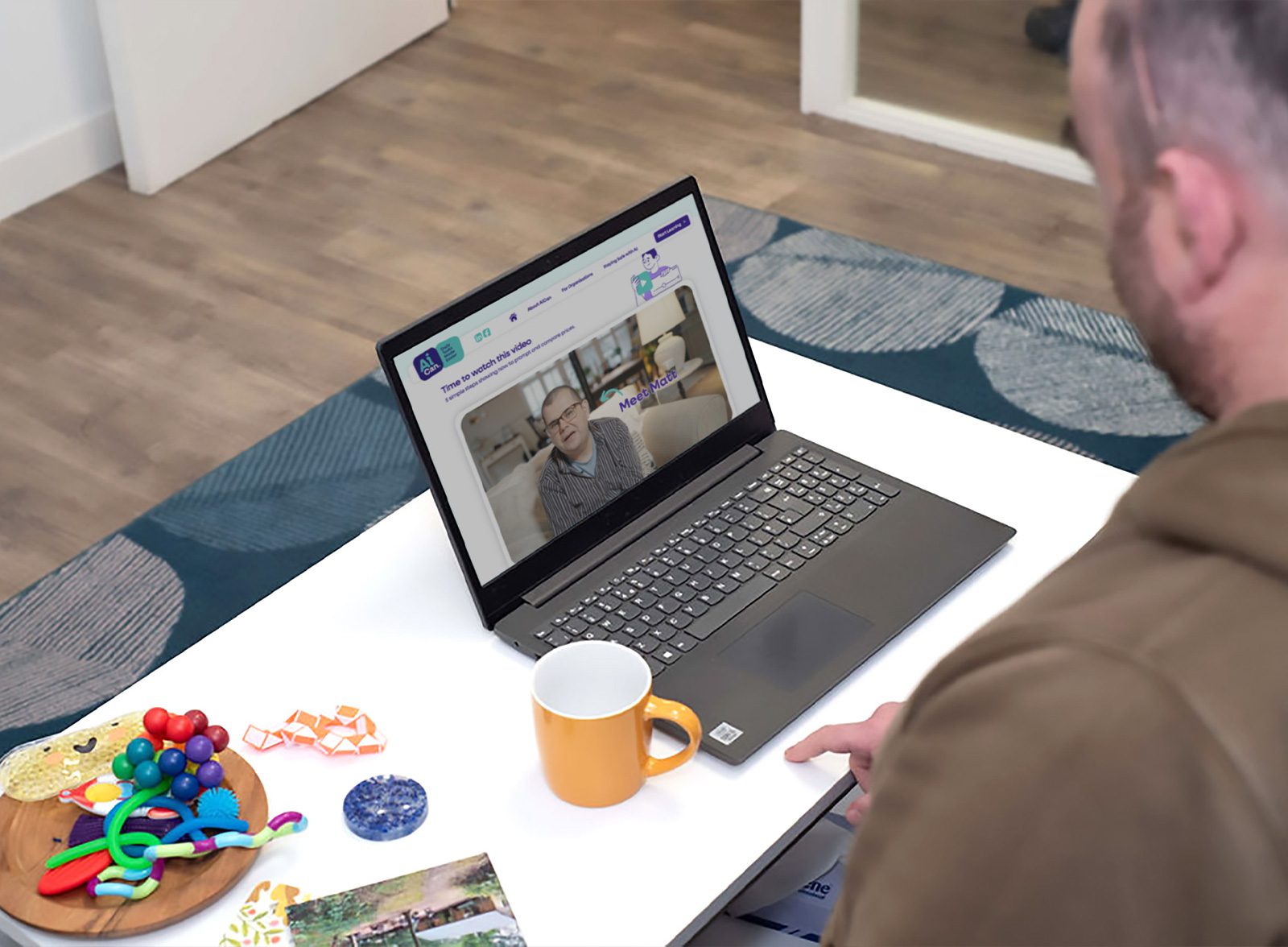
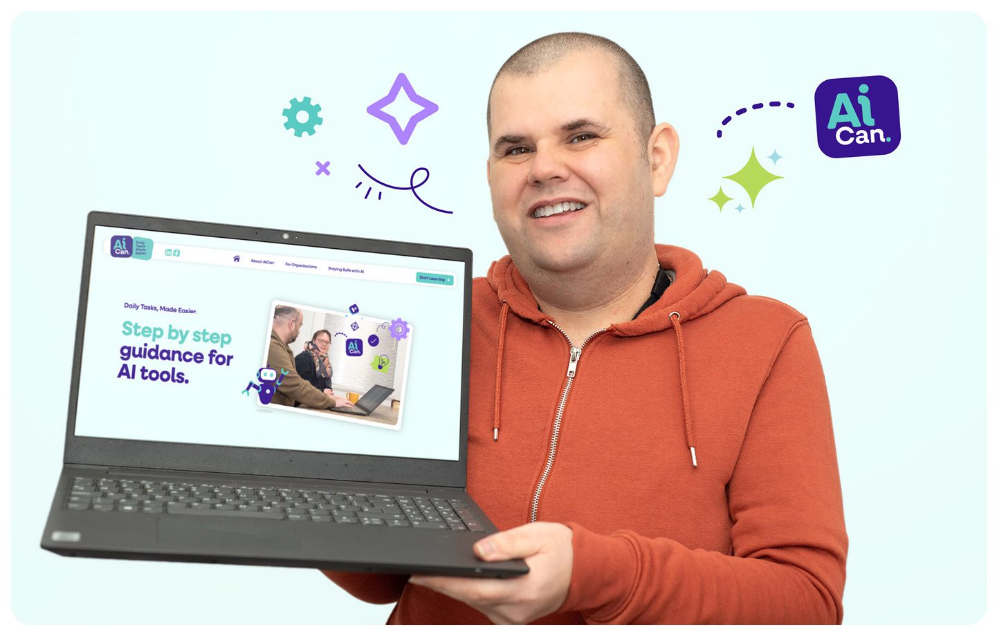
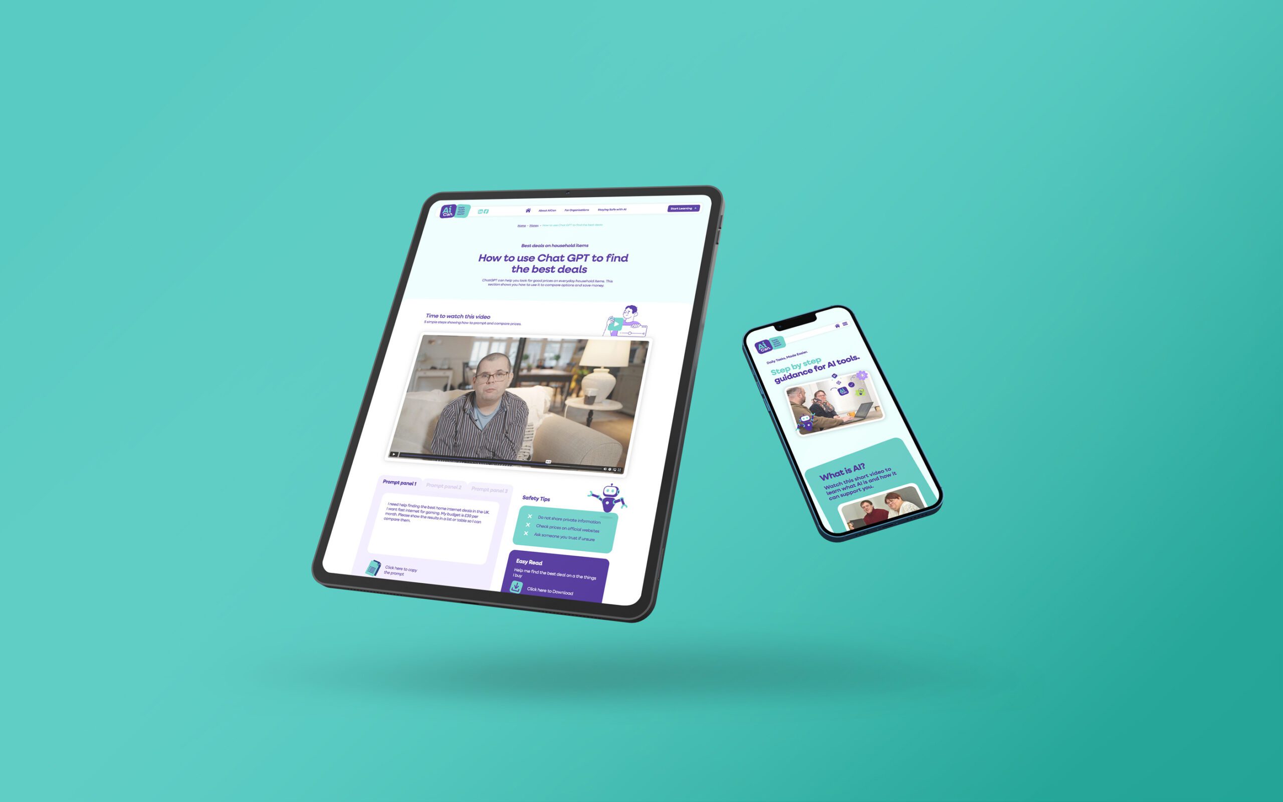
AiCan, in a clean wordmark with rounded, approachable type. A palette built for calm, not impact. Friendly illustrated icons instead of stock photography, so each part of the site — money, forms, food, home, social — feels like a place, not a category.
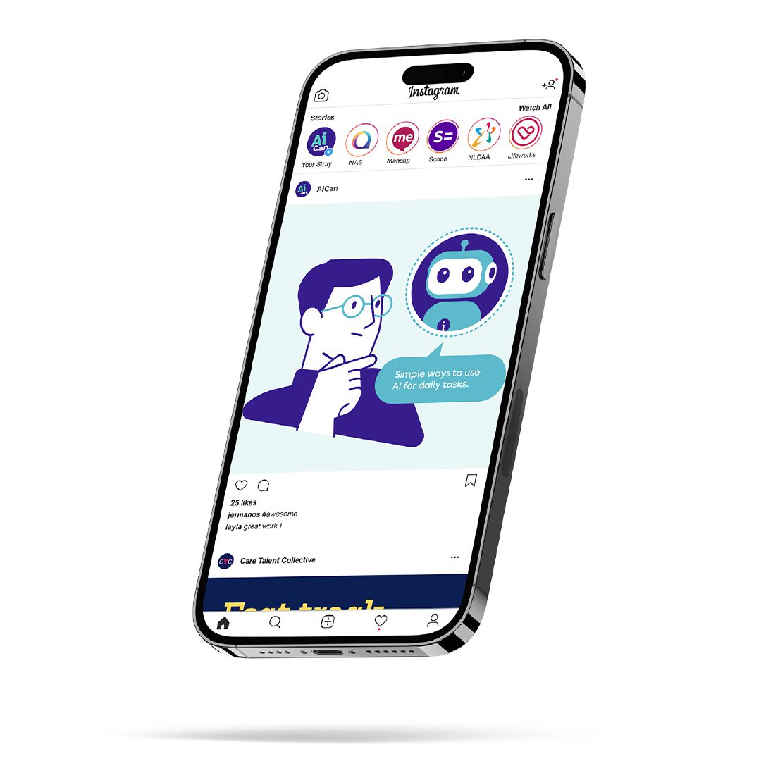
There is a robot in there, just not the kind that makes people nervous. Ours is cartoon-soft, more mascot than machine. It was one of the details the co-producers responded to best.
The website carries the same logic through: short, plain-language pages, one task at a time, nothing competing for attention. “Daily Tasks, Made Easier” isn’t a tagline we bolted on at the end, it’s the design brief, just said in four words.
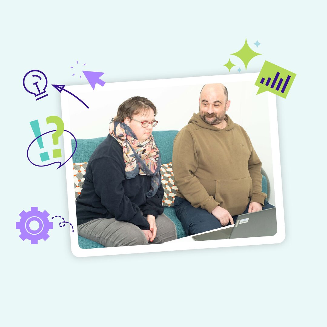
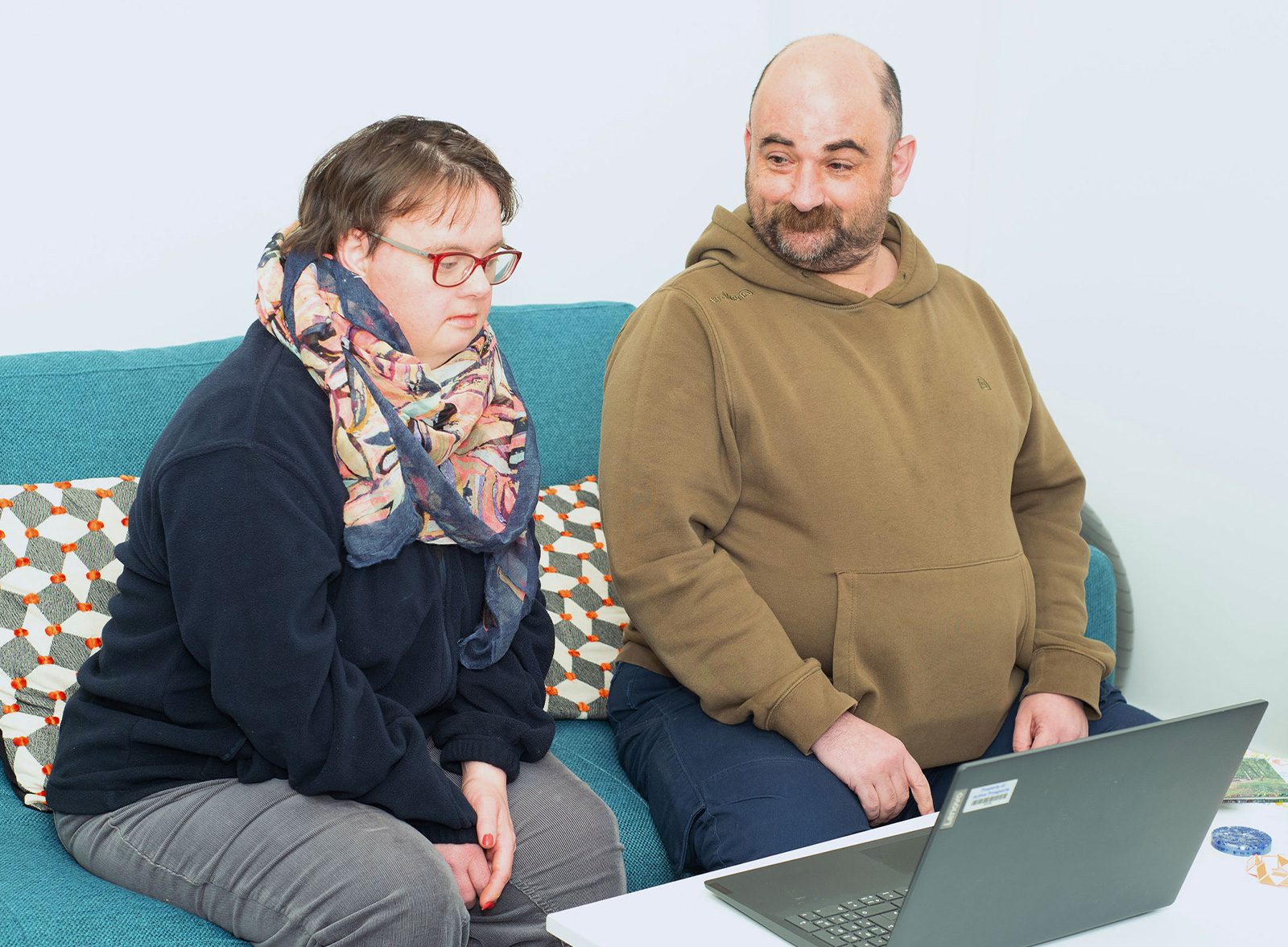
Early research from the project found that 93% of participants wanted support to build confidence in using AI safely, and that the biggest barrier wasn’t AI itself. It was a lack of understanding and access to the right help. That’s the gap AiCan, and the brand around it, was built to close.
The platform was inspired by Matt Leadbeater, whose own experience of AI making daily tasks easier shaped the whole programme. As Matt put it:
“Tasks that were once difficult have become easier with my use of AI. This idea is what AI Can was built on.”
That’s the result we were actually designing for. Not a flashier logo, a platform people with autism and learning disabilities feel safe walking into.
AiCan officially launched on 25 March 2026, in partnership with Active Prospects, Pro-Active Community, and the University of Surrey’s Centre for Vision, Speech and Signal Processing, with funding from the Department for Science, Innovation and Technology.