Digital Boxes
The challenge
To create a progressive and human brand for a managed service supplier allowing them to provide an IT service that cuts though its inherent complications.
Our approach
Digital Boxes is an emerging managed serviced supplier with the ambition to provide an IT service that cuts through its inherent complications, simplifying the industry.
Combining extensive experience, expertise and business understanding, the Digital Boxes directors were looking to disrupt the industry with a progressive and more humanised brand.
The outcome
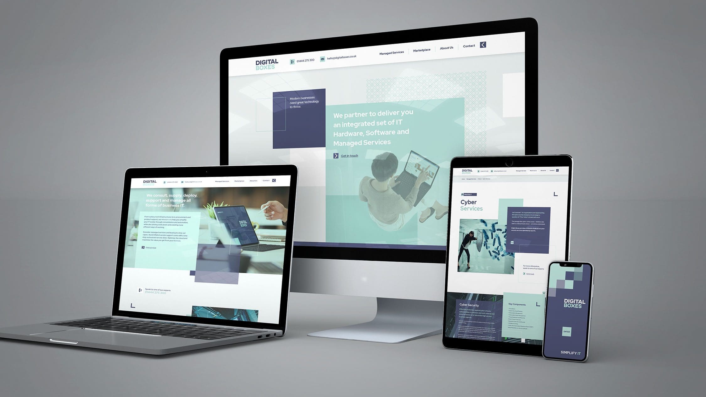
Cross Origin created a visual strategy that allowed Digital Boxes to develop ongoing campaigns giving them the character they wanted and allow them to stand-out in the industry. The DIGIT that was devised is intended to become the DNA of all things and it is adaptable enough to work as graphics or position itself as pixel. The DIGIT is everything and everywhere: it’s the ultimate digital Box.
PROJECT SCOPE
Market Research / Internal Brand Development / Brand Positioning / Brand Concepts / Visual Identity / UX-UI Design / Website Development
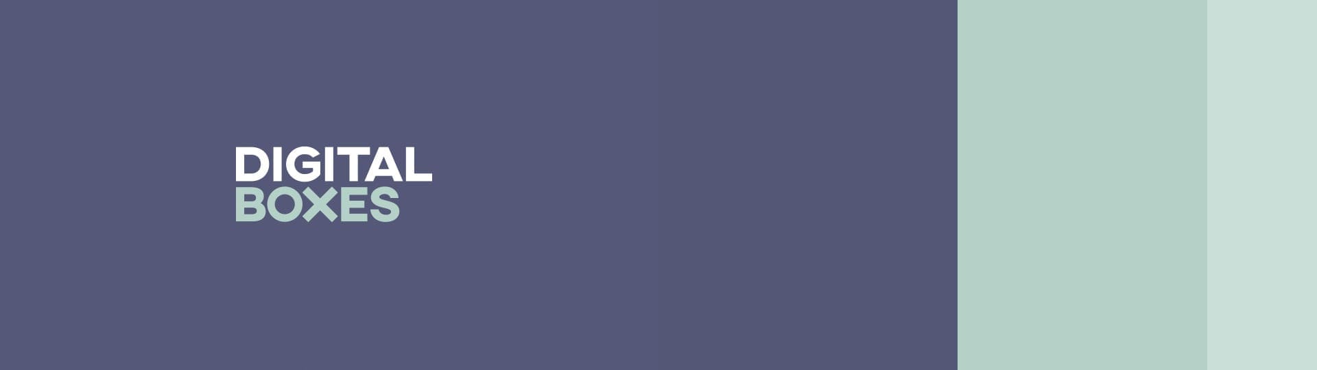


DIGIT runs through the Brand DNA, everything we create will come from DIGIT.